
Have you ever seen a film that you didn't like, but you didn't know why? The actors were good, the story made sense, the shots looked good. Why then did you leave the film feeling dissatisfied or uncomfortable?
One word: theme.
Most of the time the theme is not on the surface, in a film or anywhere. But it's always there, whether it's intentional or not (and we'll get into that in a moment). But what is a theme? It's a vague, general term that seems intimidating but isn't. Simply put, your "theme" is the look, feel and design of your website. All of these elements need to be compelling on their own, but how they work together is equally important. Don't worry, after this article,
you will be an expert.
Save time and stress by following these 5 design secrets:
When you design a website, you have to make ten thousand little decisions. This colour or that colour. This font or that font. This image or that image. And every time you make one of those little decisions, you are shaping the "look" of your website, whether you realise it or not.
There is no right or wrong way to create a look. The best advice I can give is this: be intentional. Another film analogy: have you ever laughed at a film that wasn't supposed to be funny? It was just so ridiculous that you couldn't help but laugh.
This can happen with your website too. If you make strange choices that don't fit with everything else, you are likely to evoke negative emotions in your website visitors. If you put a picture on your website, make sure it is of high quality. Blurry photos will put visitors off. Unless you are selling vintage items and the grainy quality of the photo is part of the appeal!
Don't use bright colours on your website, it's distracting and confusing. Unless your brand is also loud, then use bold colours for that very reason!
Do you understand what I'm saying? Anything can be a successful part of your look, just make sure it's intentional.
What is minimalism but a buzzword? Simply put: simple. One of the first things that drives people away from a website is confusion. Is your website too cluttered so that visitors can't find anything? You'll keep losing sales until you get rid of the clutter.
The hard truth is probably that of all the buttons, tabs and CTAs on your homepage, only a few are actually clicked. Just because it's a favourite of yours doesn't mean it belongs on your homepage. Take a look at the two examples below and you'll see what I mean.
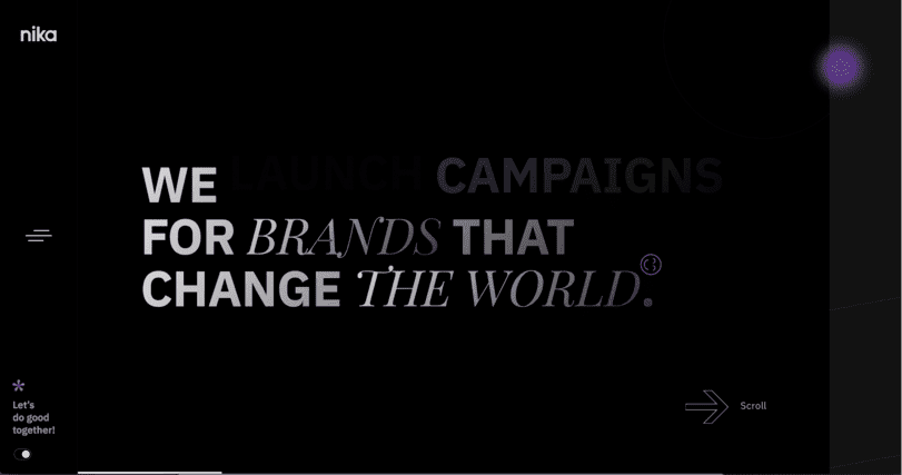
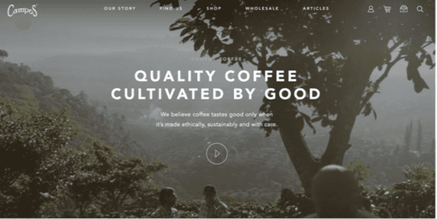
A minimalist design. Slim, clean and informative. Everything you need to know and nothing you don't.
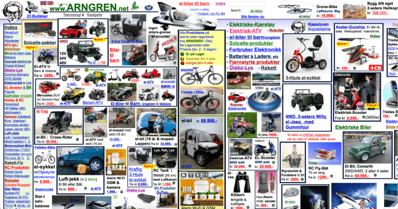
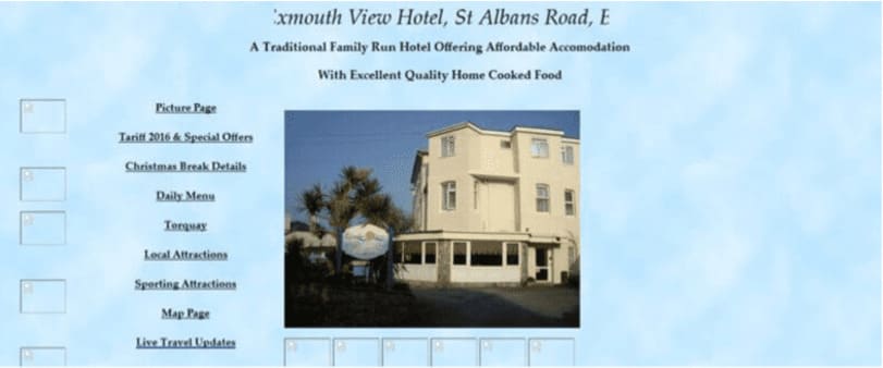
I mean, come on. Most of them are not that bad, but if your first instinct is to defend this side, you might be overloaded too.
Think back to art class. Can you list the primary colors, what their complements are, and what they clash with? Probably not off the top of your head, right?
On the flip side, I bet I could show you a website and you could tell me if the color design doesn’t work. People instinctively react to color schemes, good or bad. That’s good news for you if you take the time to learn what colors work with which. Some colors don’t mesh well, but they look good next to each other. Some colors make people uncomfortable or angry, while others make people feel welcome and relaxed. These are all important to know when designing your site.
If the first thing you do after landing on a page is cover your eyes, that’s not a good sign, and nothing you should emulate. Here are two examples: one looks great, the other looks gross. Don’t be gross.
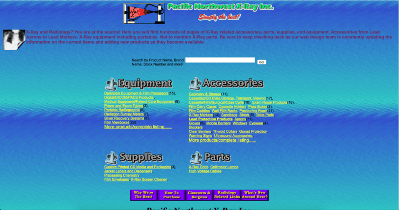
Gross. Just, ew.
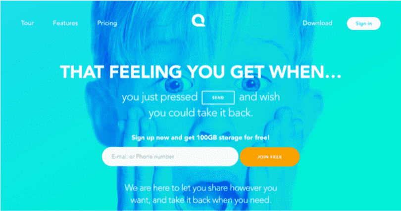
Not gross. Also uses bold, neon colors, but they work. Want to know why? Start studying.
I used an ampersand above. Not “and.” Looks better, doesn’t it?
That’s what you want out of your copy. You want it to look good, and read well. Reading well can mean a few things: proper grammar, correct spelling, concise. Be honest with yourself, did you read every sentence of this article up to now? Probably not. But did you read the headlines and captions? If your site is covered in text, most people aren’t going to read it anyway, and you might overwhelm a visitor. That will stop them from converting.
Keep it short. Say what’s necessary, and say it well.
Great copy. Short, confident, and interesting. “Good” what? You’ll probably click to find out.
What’s going on here? Lot’s of words that don’t tell you anything. Too much and too little at the
same time.
Are you selling clothing? Shoes? Printed items? Basically anything that can be customized?
Put that right up front. Studies have shown that personalized content connects with users far more than general content. So if you sell clothing, as soon as someone opens your site, they should get to choose the content they want to see.
Users looking for women’s shoes don’t want to waste time clicking through pages of men’s shoes to find what they want. Let them feel like you are customizing the site to their benefit: because you are!
I won’t put a “bad” design in this section to show you that you can personalize in a few different ways.
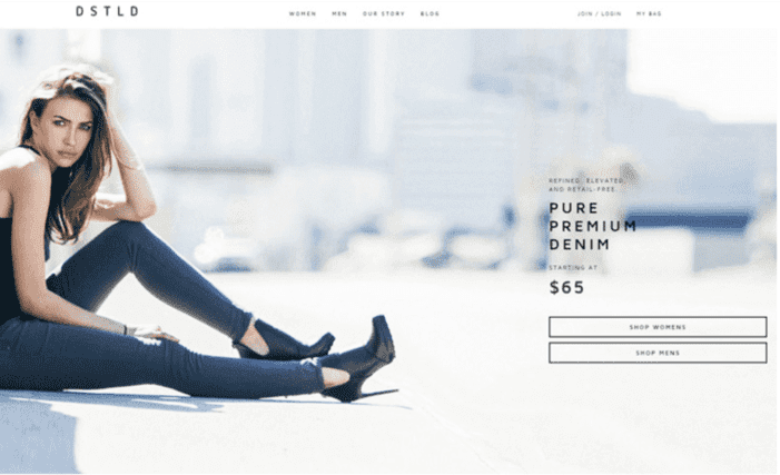
An example of good design from top to bottom: stunning images, sleek design, and good copy. You know what they sell and can get right to it.
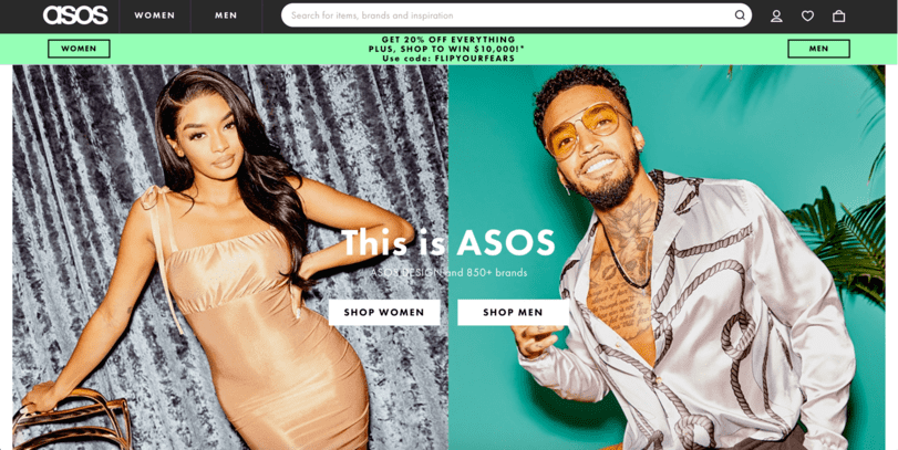
A similar concept, different execution. Not cluttered, but carries a lot more information. Still offers easy navigation to purchases.
If your website already does any one of these things correctly, you are ahead of the curve. Most people don’t put the time and effort into truly understanding how to develop a Look for their site, and they are losing sales because of it. Take the time, do the research, and you will end up with a website that looks Great, not Gross.
Our designers make websites that are Great, not Gross, and they can do that for you. Let’s start a conversation here.
Please rotate your device or refresh page