
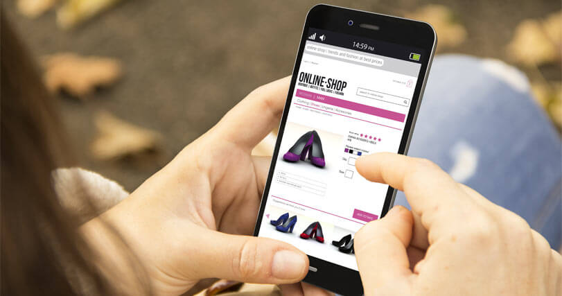
In today's digital age, the mobile internet user base has outgrown that of desktop and laptop users. With our lives increasingly tethered to smartphones, this shift is a testament to our times. To stay competitive and successful, your e-commerce site must evolve to accommodate this trend. A mobile-friendly website is no longer a mere convenience, but a necessity. Potential customers could slip through your fingers if they find your site challenging to navigate on their mobile devices. Consequently, when strategizing to boost your e-commerce site's conversion rate, prioritizing mobile traffic should be your prime focus.
According to projections by IT and networking giant, Cisco, mobile traffic will have seen a sevenfold increase between 2017 and 2021, expanding at twice the rate of traffic from laptops and desktops. This trend forecasts a surge in purchases made via mobile phones, underlining the growing demand for responsive website design services aimed at optimizing mobile traffic for e-commerce websites. If your site isn't catering to mobile users, you risk losing out to competitors who do, with the potential losses being staggering considering the burgeoning mobile user base.

Consider this - Monetate’s Ecommerce Quarterly Report highlighted that desktop conversions rose to 4% in past years, up from 3.62% the previous year. However, mobile traffic conversions also saw a jump, from 1.07% to 1.3%. This gap results from many businesses still not optimizing their e-commerce sites for mobile. Given the rapid rise of mobile internet usage, this is set to change soon. Take advantage of this shift before your competitors do, and give your online business the edge it needs by optimizing your e-commerce website. Here we show some tips to make the leap:
Increased mobile phone usage directly correlates with heightened social media activity. In fact, 80% of all social media time is now spent on mobile devices. Placing your e-commerce site within easy reach of this mobile-savvy demographic can create a ripple effect; the more your site and its content is shared, the greater the traffic to your site, and the higher your sales. A fun and engaging mobile experience that encourages sharing can be a strategic tool to boost sales.
Your business deserves to be noticed, and it should be presented flawlessly across all devices. Investing in a mobile-friendly website prepares you for success in this ever-evolving digital landscape.
Connect with us at Webgru today and discover how we can drive your website to new heights in today's mobile-dominated market. For expert assistance, reach out to our and let us show you why we are your best choice.
Please rotate your device or refresh page